CRM
Customer relations system for an insurance company.
Skills
UI,UX
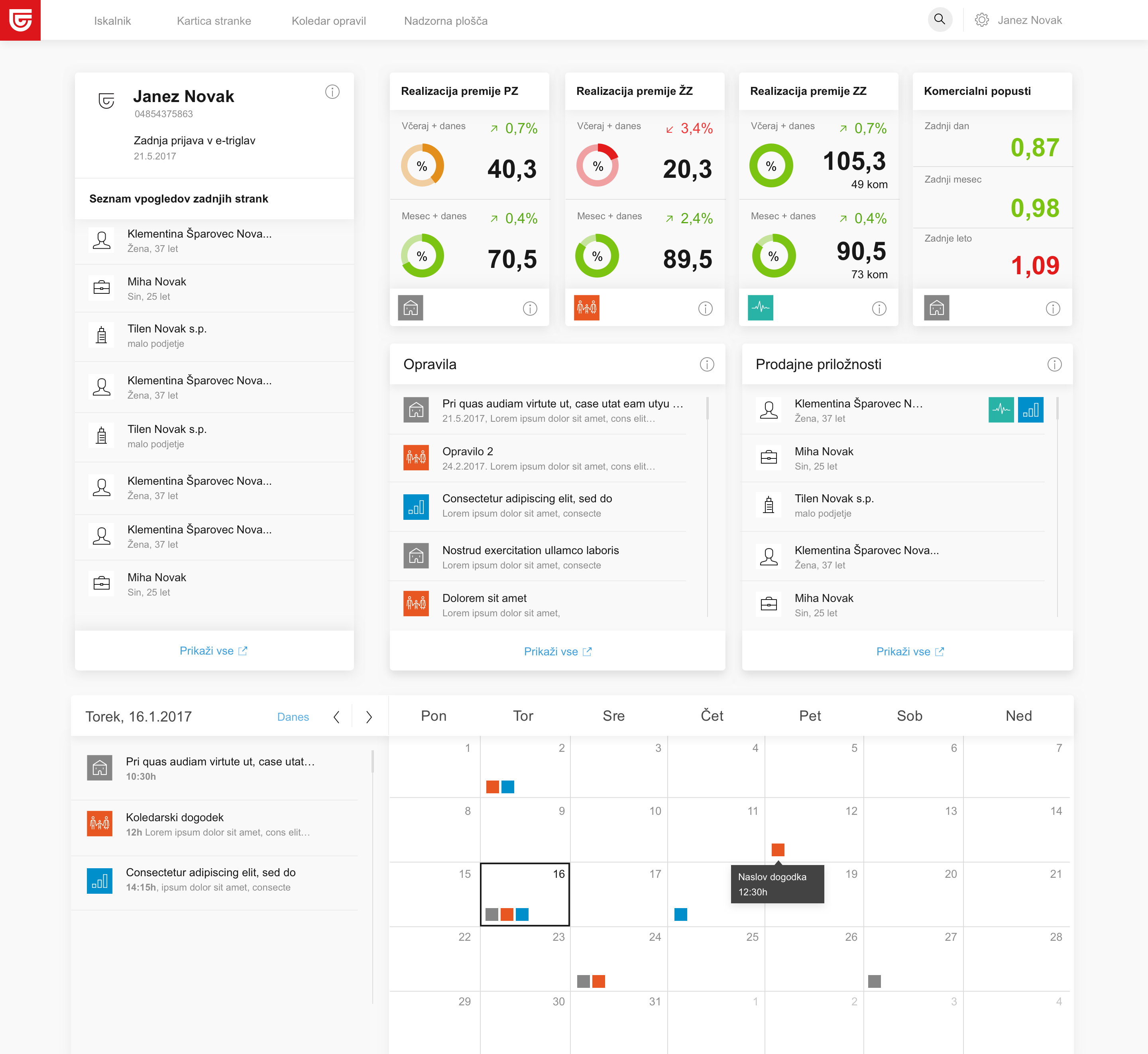
The objective was to reorganize and redesign their customer relations system. The main challenge was to reorganize their data and prioritize it. While doing an inventory of their data we realized that this is mainly a tool that has to work fast and efficient.
Another thing we noticed is that they need to have an option to add or take away certain data.
When we took all the findings from their product we quickly realize that we need to build them well-structured design system. Wich will allow them to show different data in different situations and make changes as they go and evolve the product.
It's a tool that has to work fast and efficient
Breakdown of basic modular elements that build the interface and allow us to show different data in the same visual language.
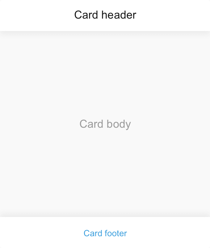
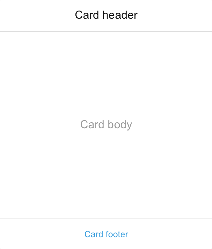
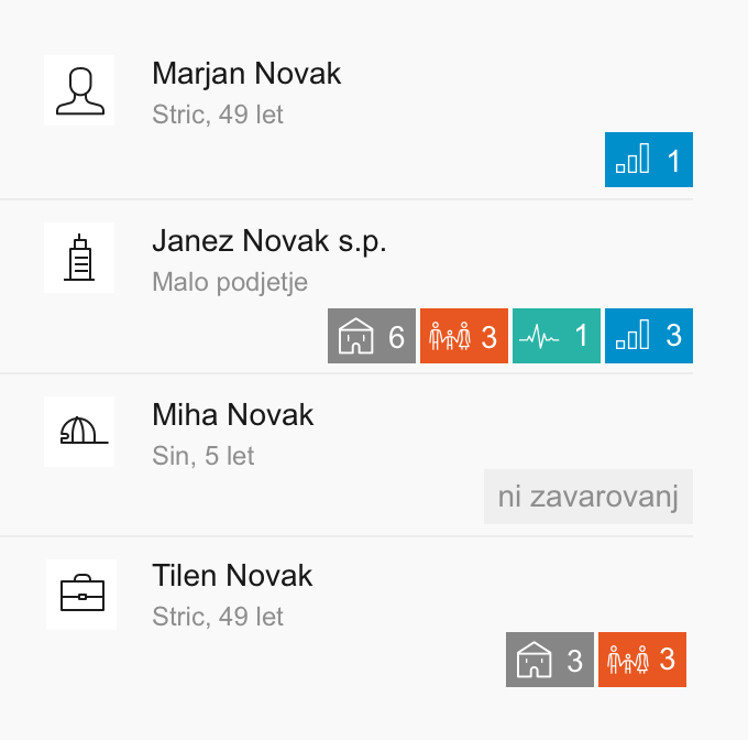
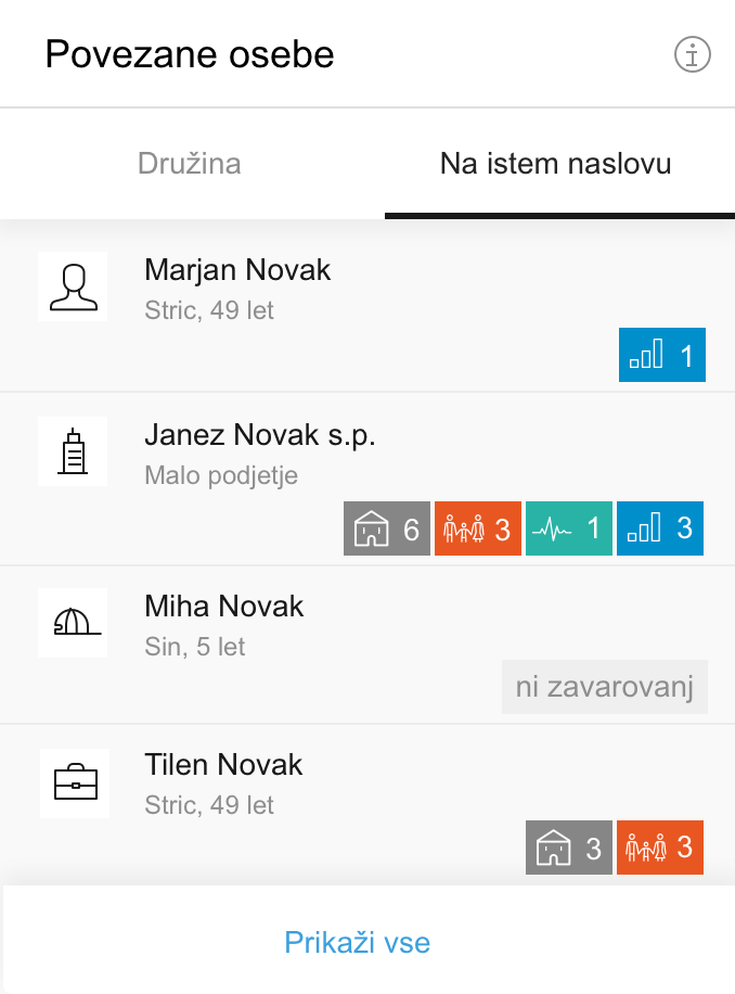
Card elements
Header
Basic card
Exposed card
Basic card - header and footer are white with subtle shadow separating them from the body that has a slight gray background.
Exposed card - used when you want to emphasize content. All white, border separating header and footer from the body.
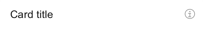
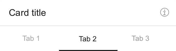
Header
Basic card header
Basic card header with tabs
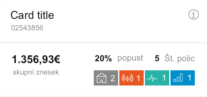
Advanced card header with icons
Body
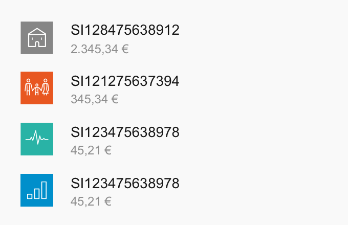
Basic card body
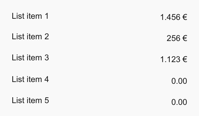
Simple body
Simple body
Footer
Simple footer

Simple footer

Simple footer

The card is broken down into the main elements header, body and footer.
Each element has different layouts to best fit different data visualizations and still, maintain the same visual language.
Header, body and footer.
Exposed card
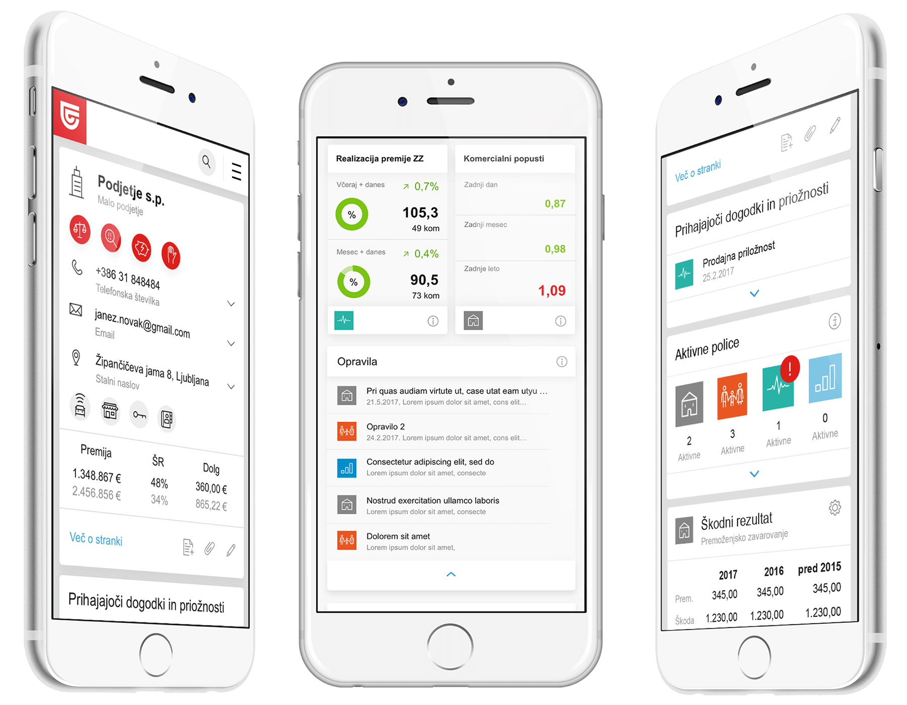
Mobile layout
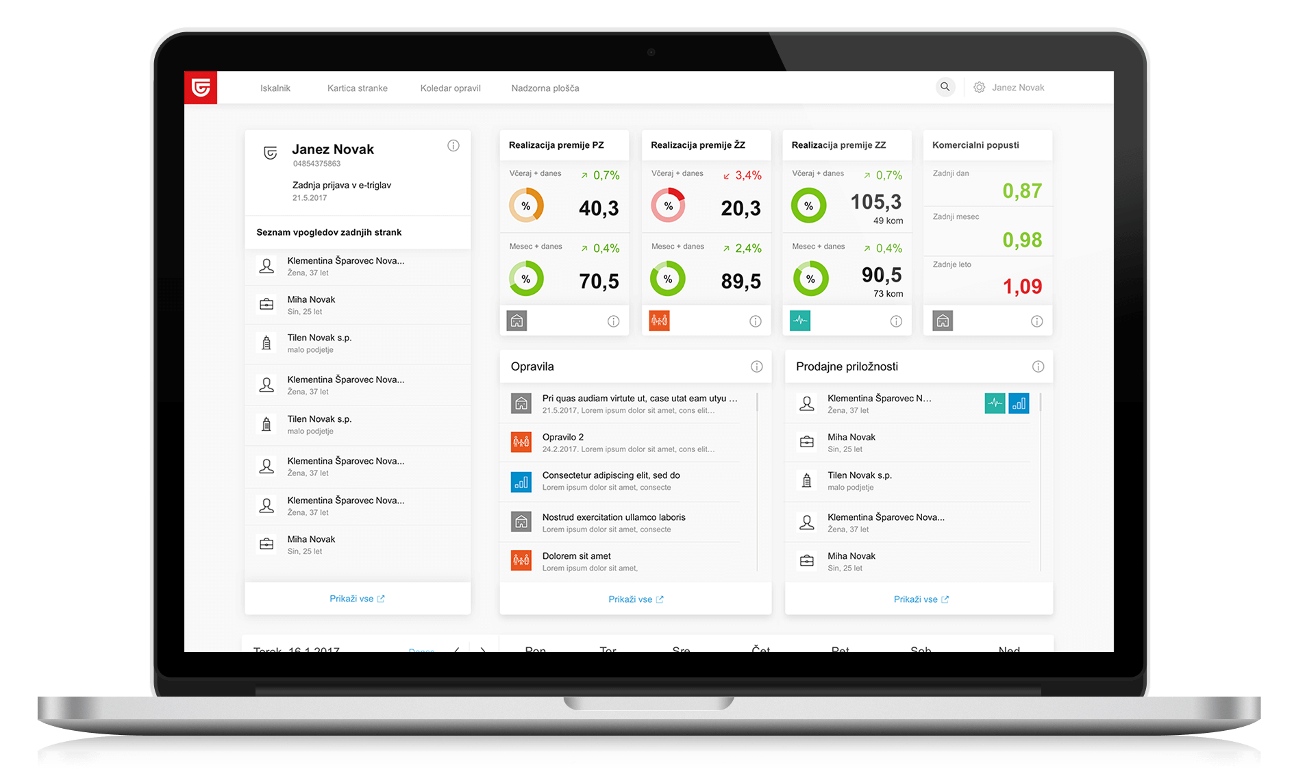
Desktop layout

Desktop layout